 MUXA Design Studio
Built on a knowledge graph connected to a medical database, a tool that helps doctors diagnose their patient based on symptoms.
Diagnostic Glass is a decision support tool for physicians. It helps doctors diagnose a patient from the symptoms captured during a visit.
It's built on a knowledge graph connected to a medical database, and it works alongside the clinician's EMR (electronic medical record).
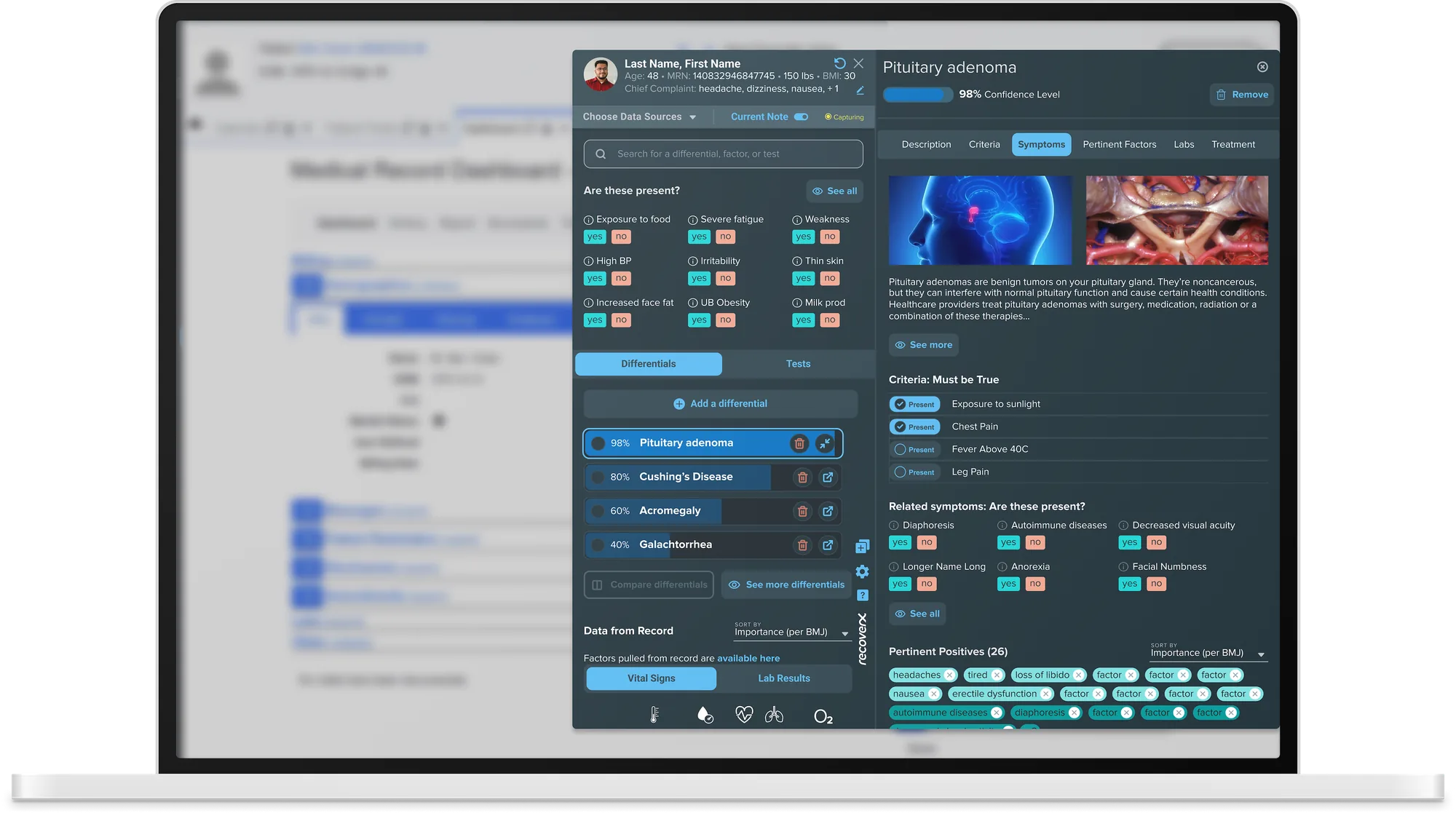
RecoverX wanted to change this by giving clinicians a decision support tool that works with their EMR.
It's hard for clinicians to stay up to date on diseases they don't often treat (there are 100k identified human diseases), and on the latest tests and treatments.
Clinicians are often overbooked and have limited time with each patient. They're usually late to a visit and rushing to get to the next one.
The EMR has a very cluttered UI and complex navigation, and often frustrates clinicians.
Research and validation are critical, but they can happen at different points. For this project, we started by combining user interviews with usability testing of the existing application. From what we heard, we created personas and user flows, and proposed the most serious usability issues to address.
We studied EMRs and what physicians expect when working with one, as well as competitor tools. We then designed wireframes and A/B tested prototypes with different variations: the UI on the right and at the bottom, in light and dark themes.
RecoverX didn't have a visual language or a design system, so we created both.
We found that a specialist, a general practitioner and a telehealth-only doctor all expect different things when diagnosing a patient.
The most common user type was the general practitioner. The one with the highest risk of getting a diagnosis wrong was the specialist.

Dr. Shiv is a specialist who works in a clinic. He wishes it was easier to research differentials during and after patient visits. He typically uses UpToDate, but it's very text heavy, and he wishes there was a resource with brief overviews or criteria tables. He'd also like to know whether a treatment, medication or test is the gold standard and reflects the most recent research.
“I want to search for differentials more easily.”
“Right now, if I type something in, it might give me something, but more likely it'll show me this big list of things and I'll need to go through it to find what I'm looking for.”
Most EMRs come only in light mode. The original Diagnostic Glass was light as well, and there wasn't enough contrast between the two, which made it hard for a clinician to tell them apart. We proposed a dark theme, and updated the light theme too.
The app follows the default setting on the clinician's computer, with the option to change themes in settings.
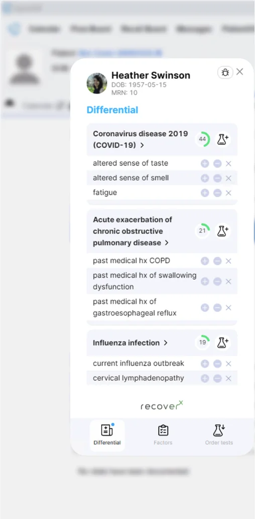
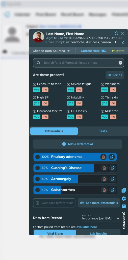
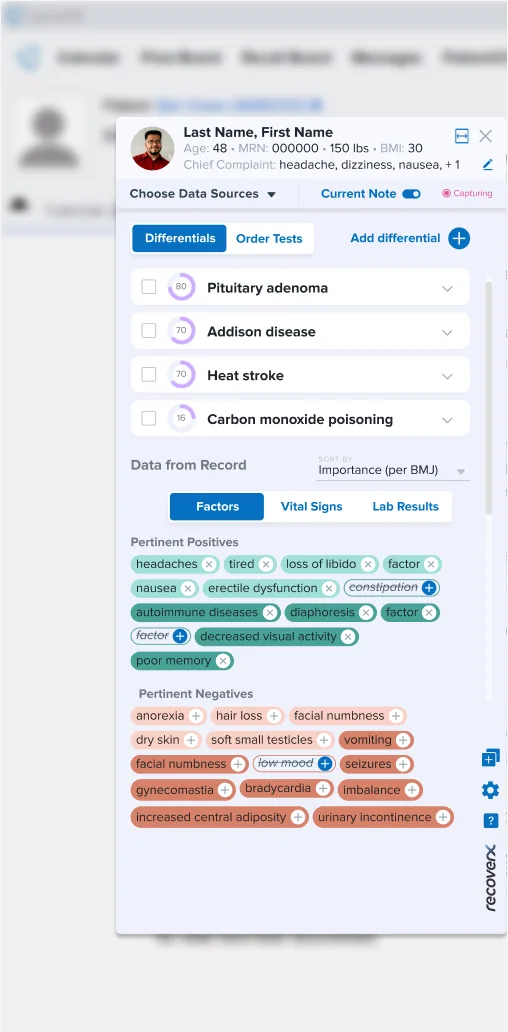
Building consistency through components. RecoverX did not have a design system, so we created a modest one to start with. The focus of the colors was to be AA accessible.
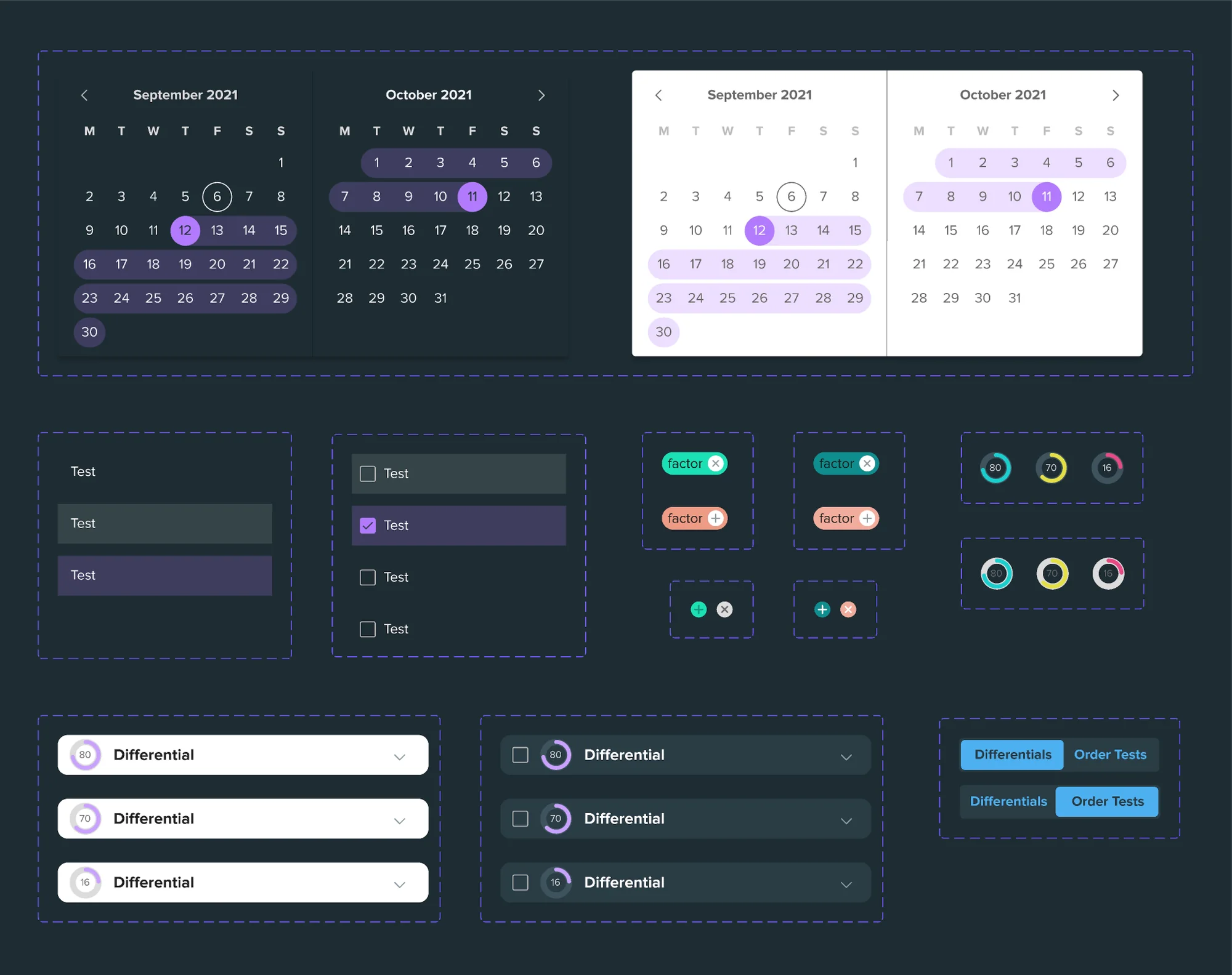
After usability testing the original version and applying usability heuristics, we designed the next version in dark theme, to increase the contrast between the EMR and the UI.
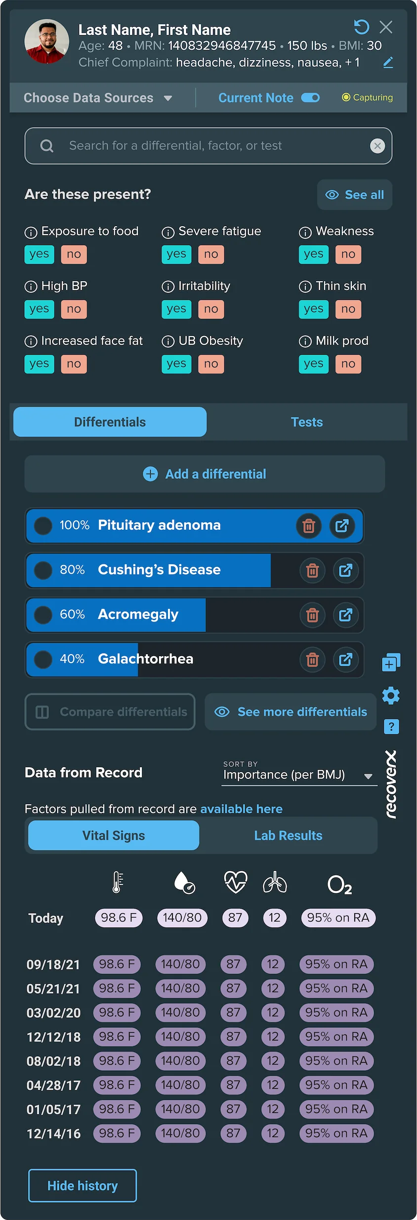
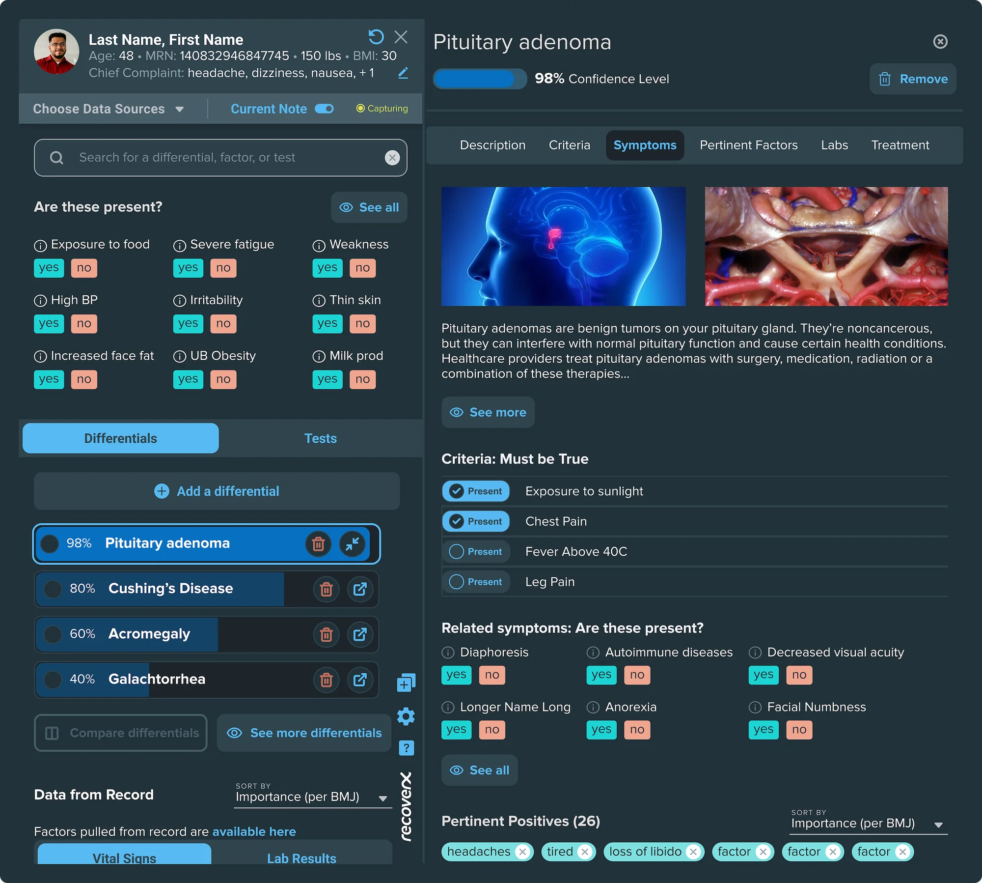
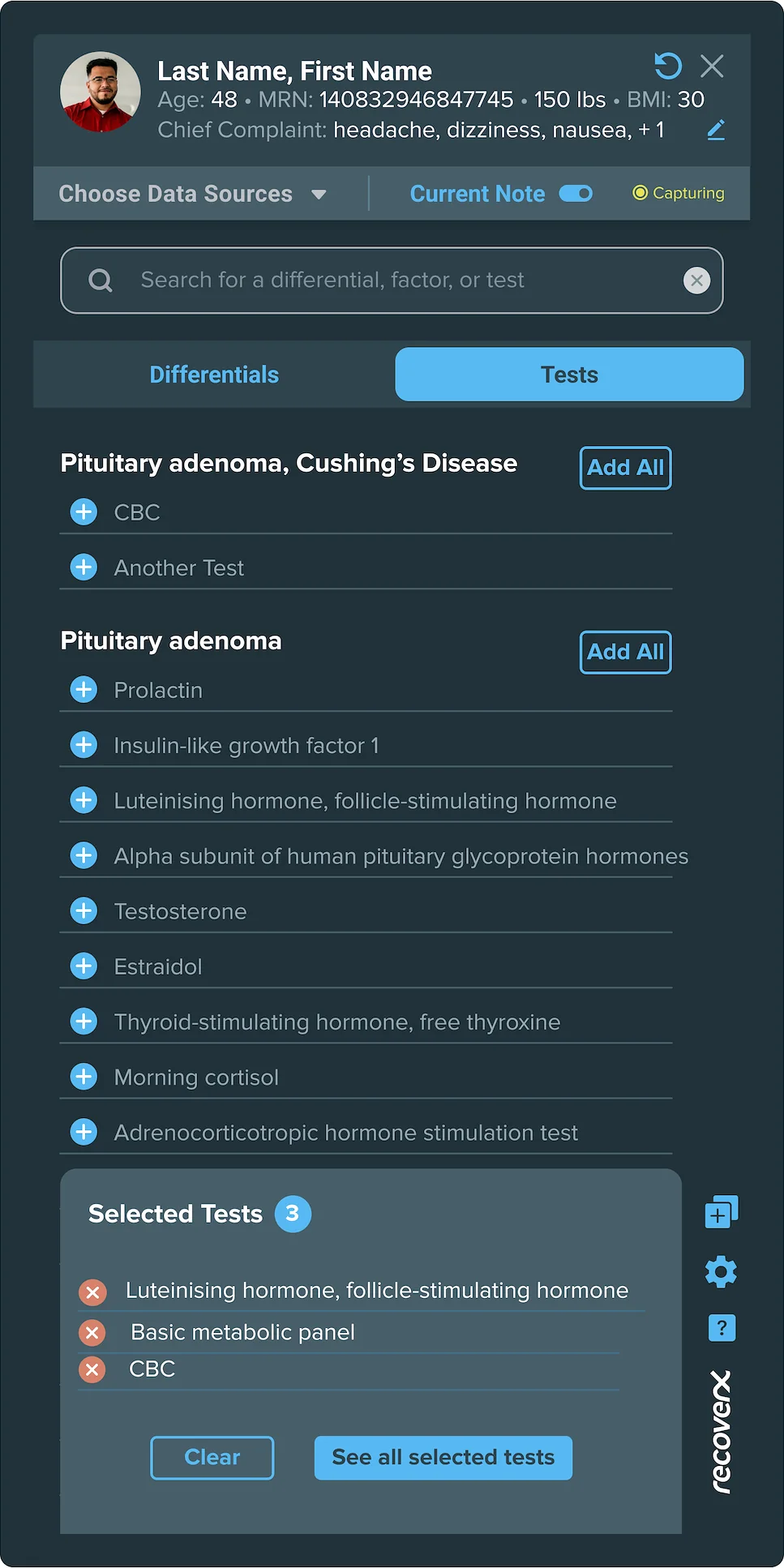
The designs carry a lot of information, because clinicians are not typical consumers. They're power users who want as much information as possible without having to interact with the UI. They're multitasking: talking with the patient, processing what they say, asking questions, writing the note in the EMR, and thinking about what the diagnosis could be.
Each screen answers the questions a doctor like Dr. Michelle, a cardiologist, has at that point in the visit.

More selected work across enterprise AI, complex internal systems, and consumer fintech.
↑ Back to top