A life insurance application for agents and consumers

Modernizing the life insurance application so it's easier, faster and less daunting.

Client
Afficiency
Sector
InsurTech, life insurance
Role
UX UI, User Research, Design System
Focus
Agent and consumer e-app, Responsive design, White label
Year
2022 to present
ServicesSaaS UX designProduct redesignDesign systemsEmbedded design team

An agent and consumer e-app

Afficiency aims to deliver life insurance products 100% digitally, from quote to policy issue to administration, either self-service or with an agent assisting.

Their main offering is a back-end API: an end-to-end life insurance application and processing experience for life insurance agents. Their second is a front-end experience that insurance companies can white label. Their third supports a worksite model, where an employer offers life insurance to its employees.

Their goal was to improve the UX of all of them.
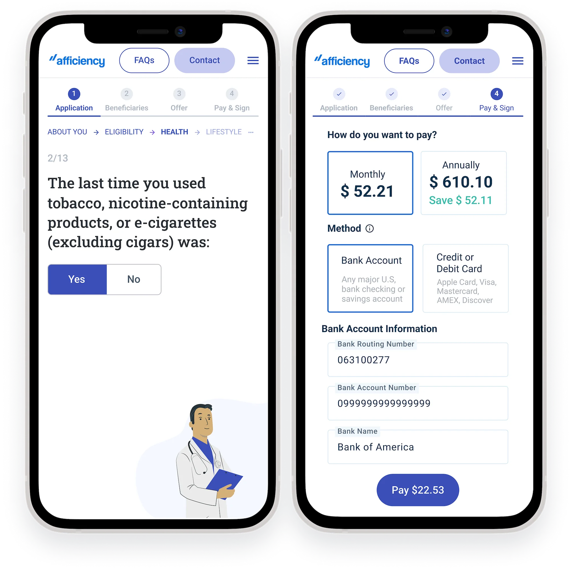
Afficiency consumer life insurance application on two phones
16+
Products designed
For Afficiency over multiple years, and counting
2
Core experiences
Agent and direct to consumer
3
Screen sizes
Desktop, tablet and mobile, so agents can work from anywhere

An industry running on manual processes

For agents, the life insurance process is inherently manual, and the industry is full of outdated systems. For consumers, life insurance is difficult to understand, compare and purchase.

Outdated

The agent-facing app design was outdated and missing key features, like autosave and a future-dated payment option.

Not responsive

Neither app was responsive, which made them unusable for one of the key personas: the life insurance agent on the go.

Inconsistent UI

With no design system in place, the apps looked disjointed, with a mix of fonts and styles.

A long partnership, one project at a time

We've been working with Afficiency for multiple years and have designed more than 16 products for them, and counting. Each project has had its own process, depending on what was needed and how much access we had to users.

At the start of the first project, we tested their existing application with agents and consumers. The findings became the base for the usability updates that followed.

  1. EmpathizeCombined user interviews with usability testing of the existing app.
  2. PrioritizePrioritized the usability issues to address and the new features to include.
  3. Document and ideateCreated personas and user flows based on the research.
  4. Competitor researchResearched similar apps: what they do well and badly, and what users complain about.
  5. DesignCreated wireframes and visual design to address usability issues and roadmap features.
  6. PrototypeCreated workable prototypes based on the users' needs and documented use cases.
  7. ValidateUsability testing to gather feedback and iterate on the designs.
  8. Rinse and repeatWe iterated and re-tested the prototype.
“We're very happy with our ongoing relationship.”Janelle Jenkins, VP Marketing, Afficiency · Verified Clutch review

Two personas, one for each app

The agent and the consumer had similar goals and tasks, but very different backgrounds and expectations.

Persona photo for Andy
Agent
Andy
Life insurance agent, licensed in 10 states

Andy is a life insurance agent who is licensed in 10 different states. He used to work in a different industry, and switched to selling life insurance during the COVID pandemic.

“I need to close as many deals as I can so that I can receive my commission. I pride myself in providing a great experience for my clients.”

Motivations

Receiving commissionEasy to close a dealCustomer referralsCustomer satisfaction

Goals

  • Pre-qualify the client as quickly and effectively as possible, to avoid declines at the application stage
  • Have the application go quickly, with as little friction as possible
  • Ask only the most necessary questions before getting to the true offer price
  • Educate and guide clients toward coverage amounts that suit their lifestyle and goals
  • Resolve issues with an application on his own, or get support easily

Frustrations

  • Explaining to a qualified client that they are declined, without knowing why
  • Needing to refer to the Product Guide for rate class
  • Forgetting to ask a knockout question, or anything else that may contribute to a decline
  • Getting to a quick quote takes several steps
  • Sometimes the SMS authorization doesn't work
Persona photo for Sally
Consumer
Sally
First-time life insurance buyer

Sally is a millennial who recently purchased her first property and wants to buy life insurance. Her job doesn't provide it as a benefit.

“I need to purchase life insurance easily and quickly to get it out of the way.”

Motivations

To understand her optionsEase of useSpeedInstant coverage

Goals

  • Security: to purchase life insurance for peace of mind
  • Understand her coverage needs for her situation, and the terminology and terms
  • Understand what she qualifies for, and see more than one option
  • Be able to reach support if she doesn't understand something
  • Receive life insurance instantly

Frustrations

  • Doesn't understand the insurance terminology
  • Doesn't know which coverage options make sense for her
  • If declined, doesn't know why or what to do next, and doesn't know that a decline can prevent her from applying at other carriers

User flows and wireframes

We focused on the top two experiences: the agent experience and the direct-to-consumer experience. Switch between them below.

Lead form
Agent inputs lead form fields to estimate cost for client
Quote
Agent adjusts coverage terms until client is satisfied
Agent pre-screens client once again
Saves for later and/or shares
Returns at a different point to continue
Application
Agent collects PII: name, address, phone, email, SS
Confirm address screen
Agent starts application and UW questions
Email sent to client to let them know an application has been started
An answer triggers a yield sign, yield sign message appears
Agent changes answer
Consent
Agent enters SS# and client provides verbal consent
Decision
Approval/decline is generated
If declined
Agent pivots to another distributor to try and get the client approved for another product
Offer
Agent adjusts coverage terms again
Adds riders
Adds beneficiaries
Signature & payment
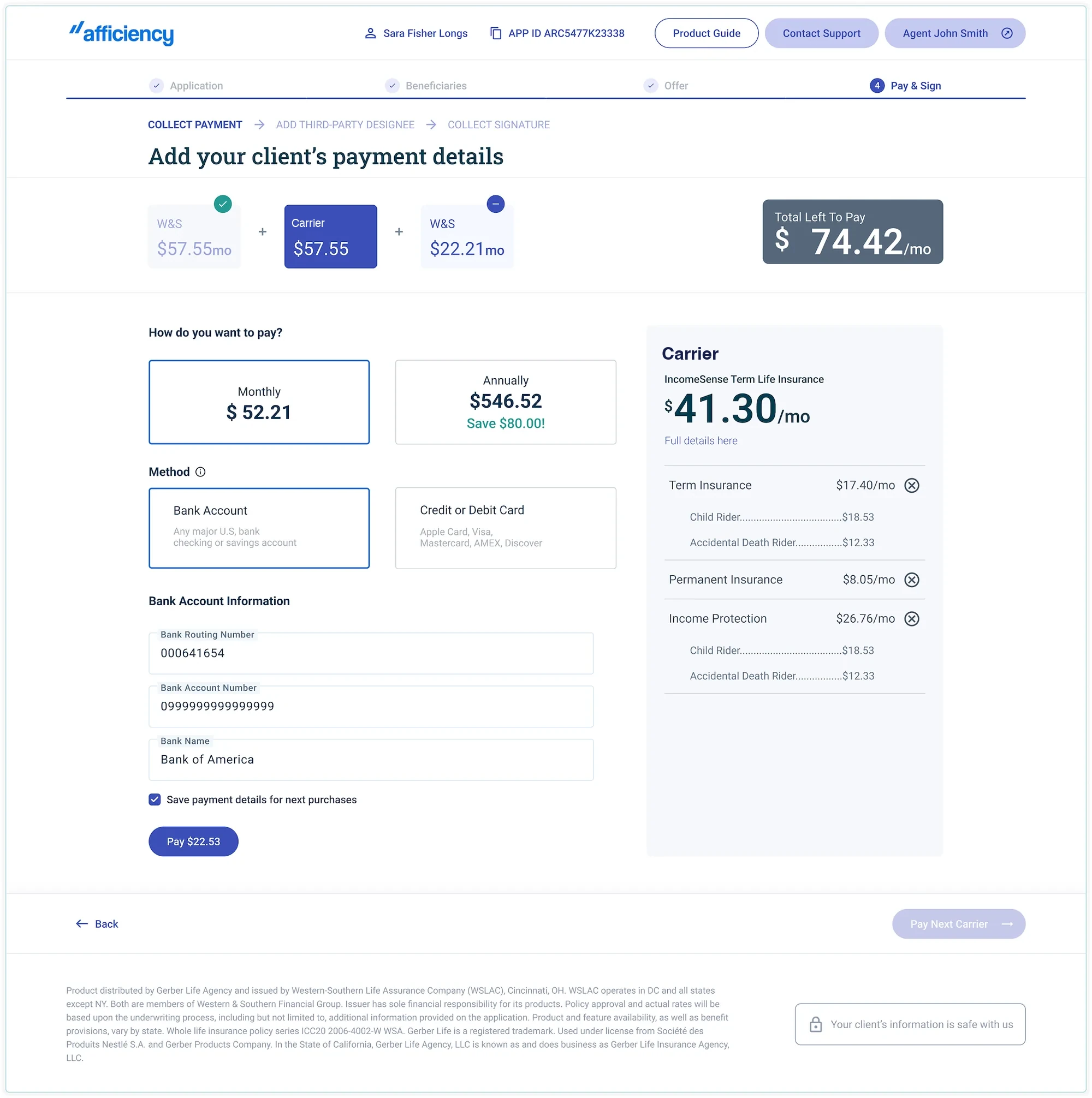
Agent collects payment info
Agent sends SMS for signature, client provides signature
Congratulations screen
Congratulations email and next steps
Main pathAlternate path

Wireframes

We used wireframes to make sure we were meeting the user and business needs. We prototyped them and used the prototypes for usability testing.

Agent experience

The agent is a power user. They expect as many controls as possible so they can customize their client's coverage, and they expect to use the product on a tablet or phone so they can sign up prospective clients from anywhere.

The limited color palette and styles in both experiences are for demonstration only. Afficiency's product is the API and the template screens. Each client white labels the UI and customizes it to fit their brand.
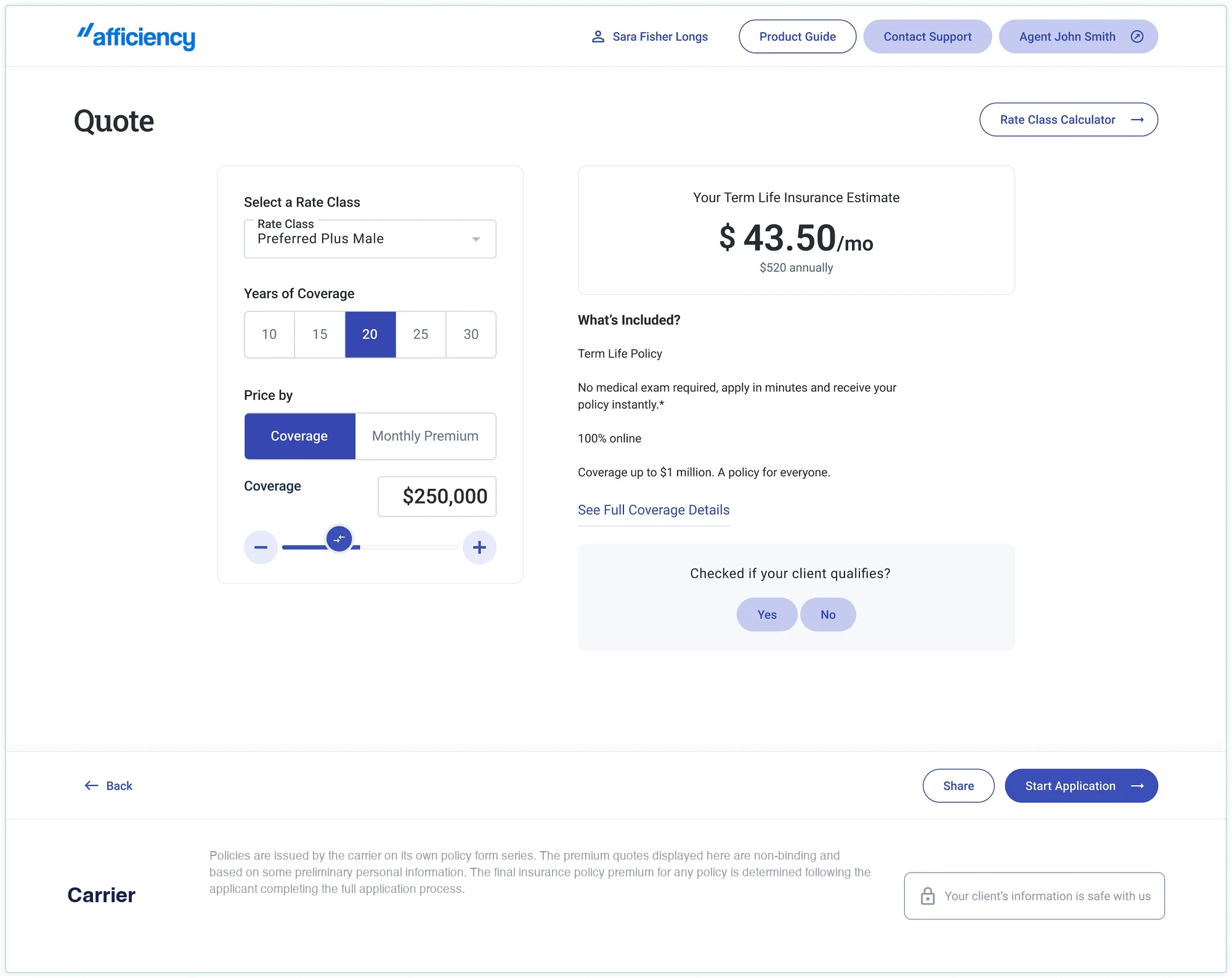
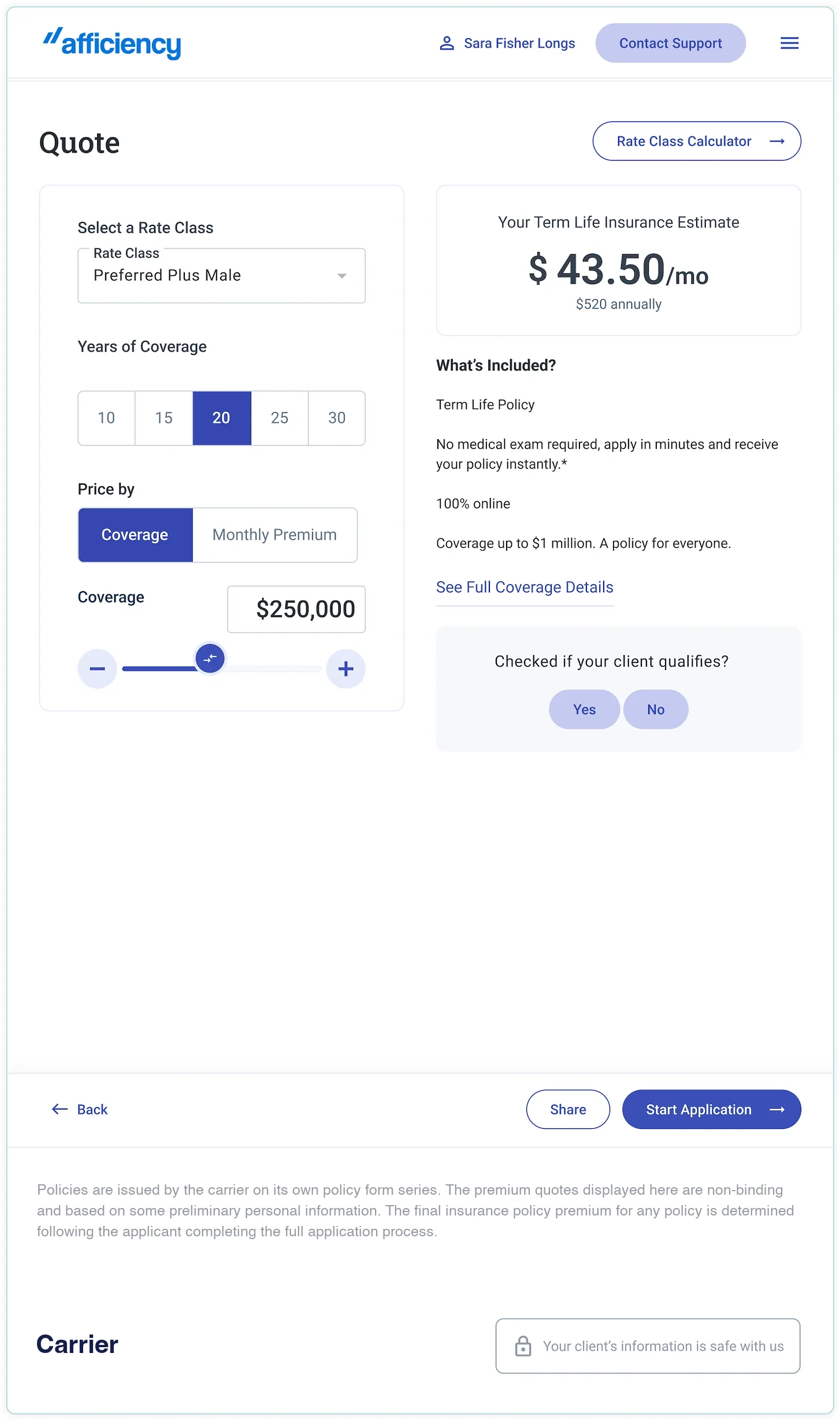
Quote

Afficiency agent quote screen on desktop
Afficiency agent quote screen on tablet and mobile, view 1Afficiency agent quote screen on tablet and mobile, view 2

Consumer experience

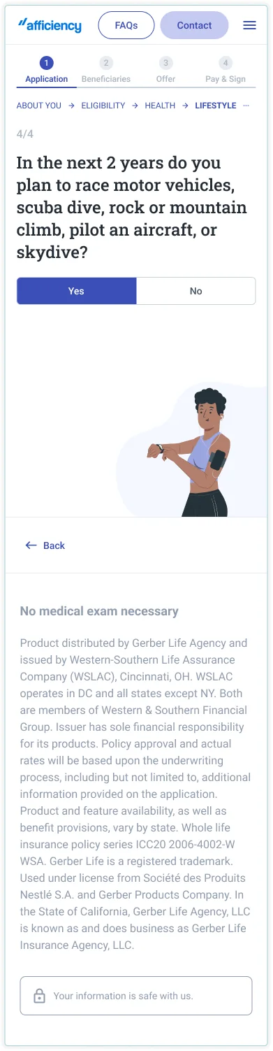
For the consumer, we went with a single question per screen, to make the application feel more like a conversation. The progress bar at the top, and the count of questions completed and remaining, show how much is left.
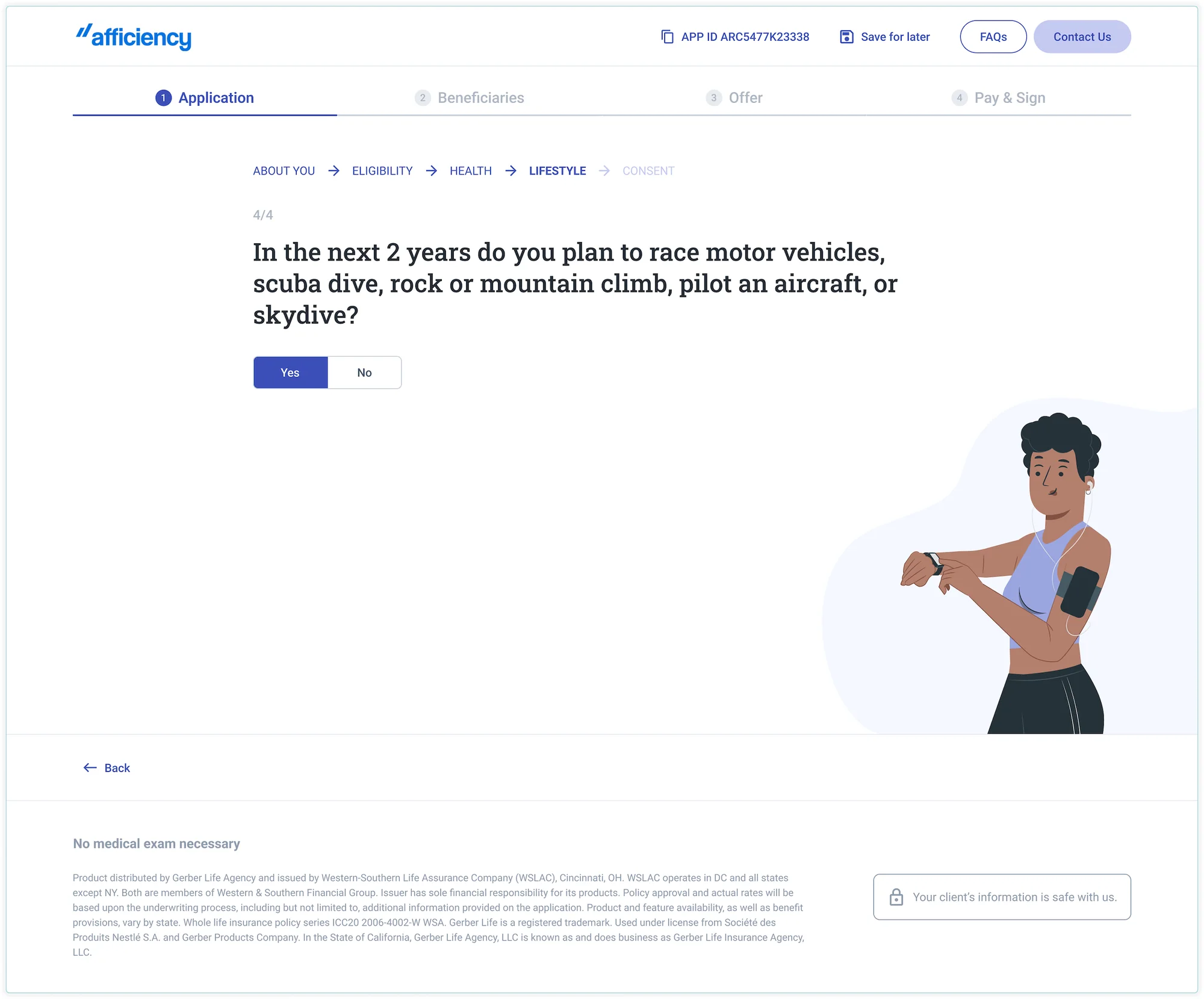
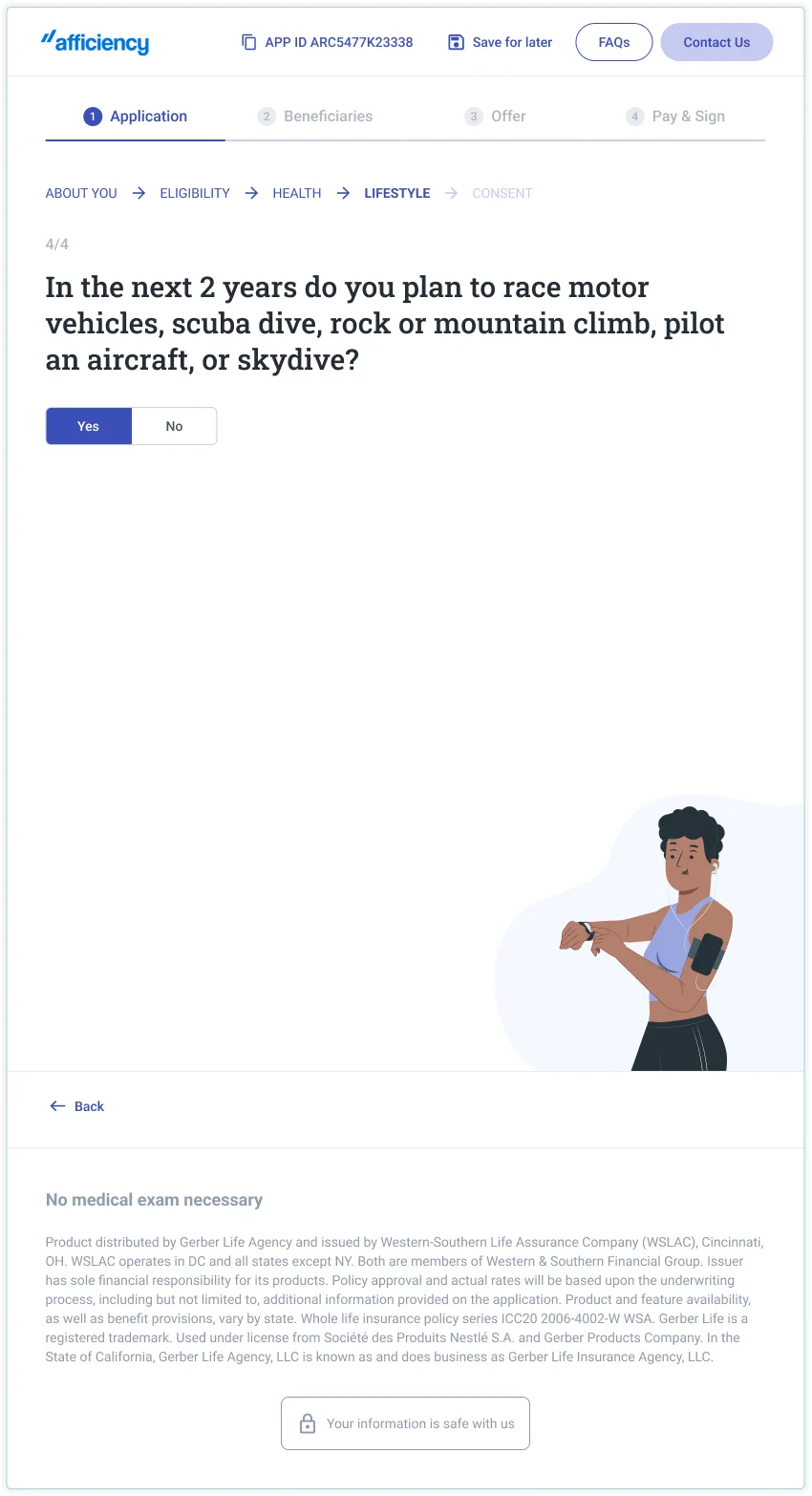
Application question

Afficiency consumer application question on desktop
Afficiency consumer application question on tablet and mobile, view 1Afficiency consumer application question on tablet and mobile, view 2

Payment details

Afficiency payment details screen with a policy summary

Design system

We used Material UI as the foundation for styles.
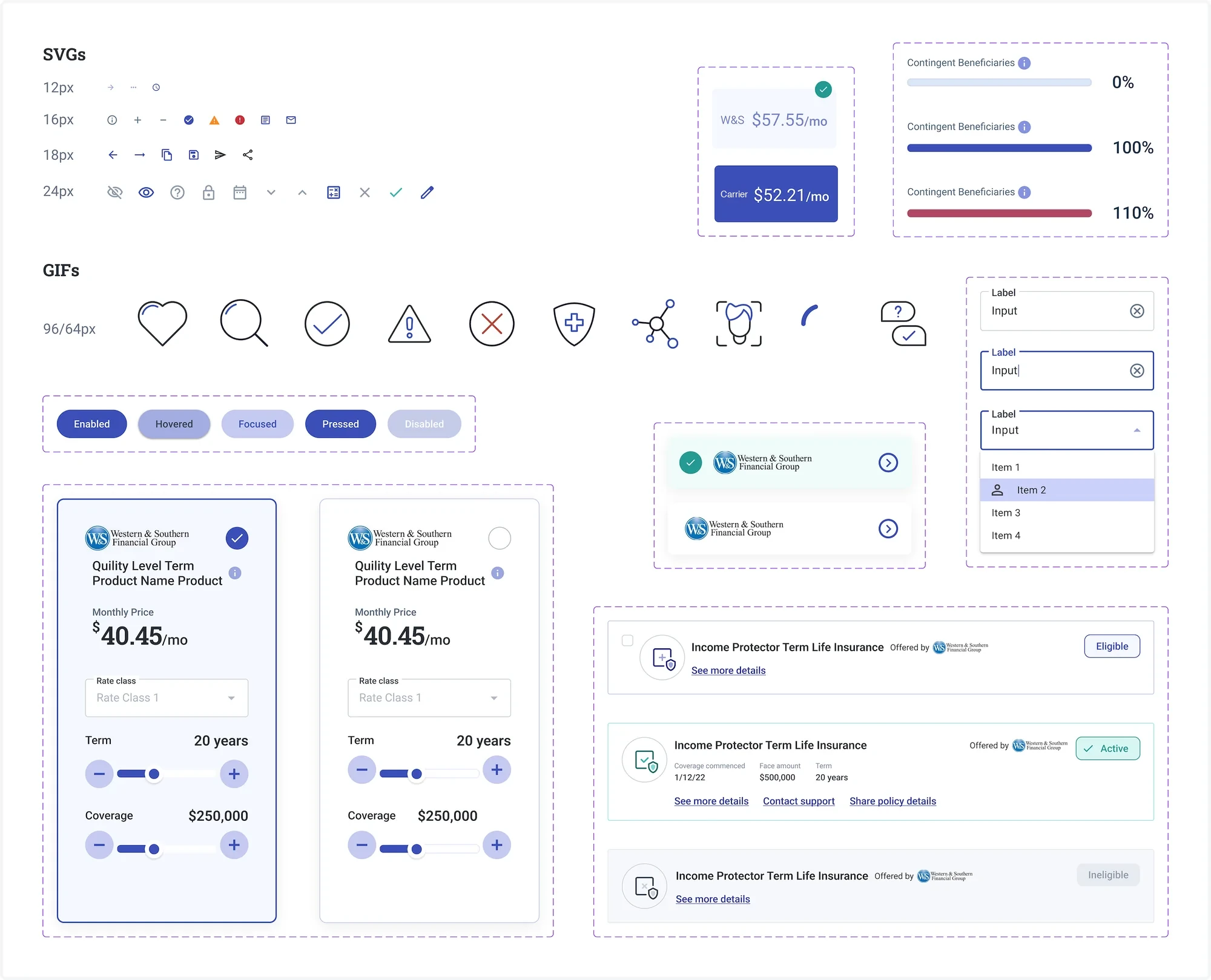
Afficiency design system components

Read another case study

More selected work across enterprise AI, complex internal systems, and consumer fintech.

↑ Back to top