Typeform for Web3

On-chain surveys for when you need more security.

Client
Phorms
Sector
Web3
Role
UX Strategy, Product Design
Focus
Token-gated surveys, Wallet login, MVP concept
Year
2022
ServicesUX consultingSaaS UX design

Phorms

In summer 2022, there was no tool for token-gated surveys: surveys that only the holders of a particular crypto token can answer.

Phorms set out to be that tool. We had two weeks to turn the idea into a product concept.
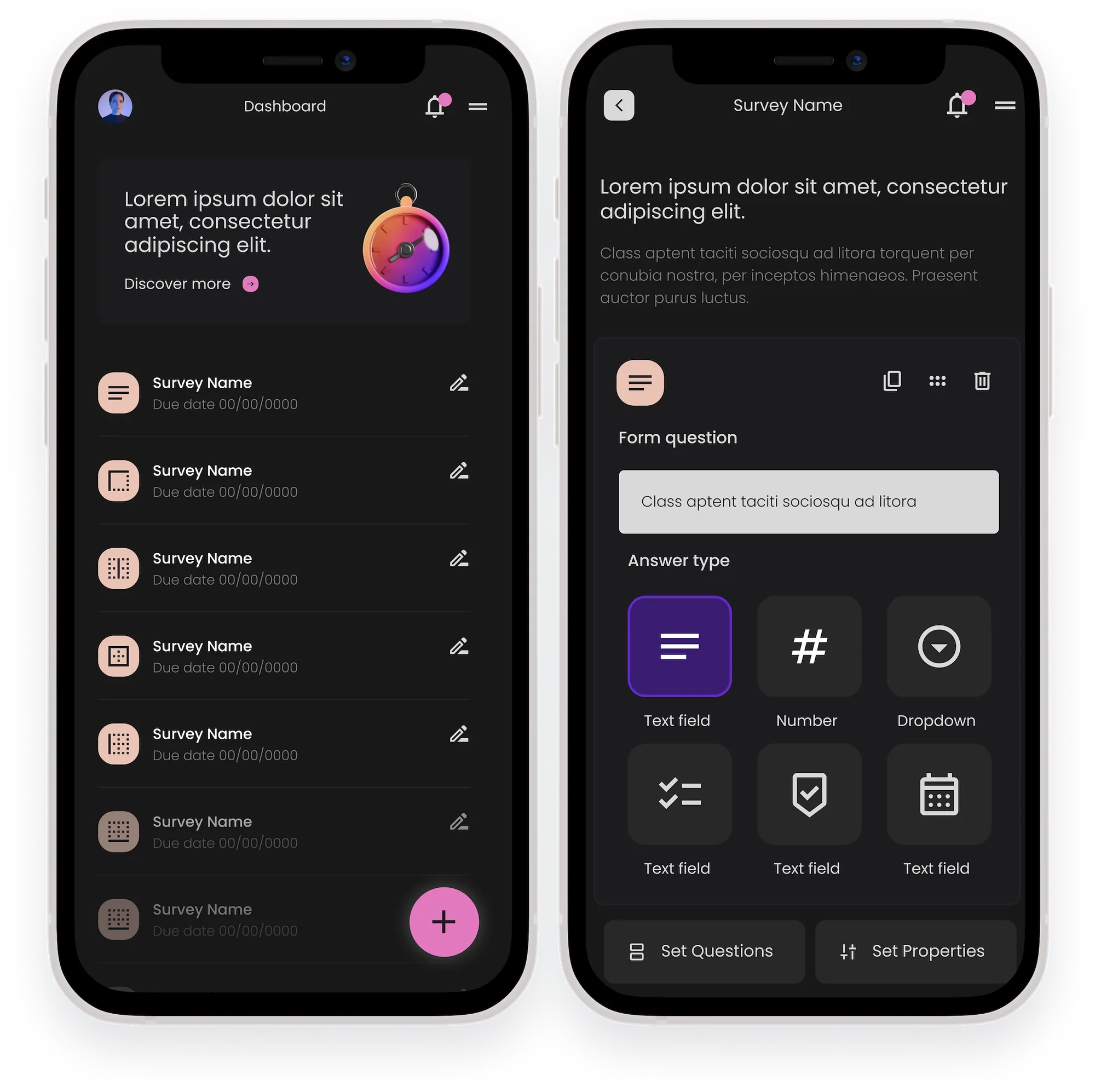
Phorms dashboard and form builder on two phones
2 weeks
Start to finish
The first week went to defining the product with the CEO
2
User types
Form creator and respondent
2
Themes
Dark and light, both explored

Why a Web3 survey tool is needed

  • A more secure alternative for people who want to collect data and choose their audience more intentionally
  • To verify respondents through their crypto wallet, so responses truly come from the right respondent
  • Everything is public and available on the blockchain. If Phorms disappears, the information is still there
  • No personal information needed. In Web3, email is too personal to share

No token-gated surveys

Specifically, no decentralized, censorship-resistant survey.

Alternatives are not enough

Using Google Forms is insecure, because anyone can discover the survey link and share it, which ungates the form.

Authentication

With the solutions available, there was no way to authenticate a respondent by token.

Two weeks, shaped around the outcome

We customized our process to what the client needed. We only had two weeks to complete this concept, and the first week was spent helping the CEO define his solution as a product and identifying the need it was really solving.

  1. UnderstandDiscovery session with the stakeholders to understand goals and vision.
  2. PrioritizePrioritized the v1 features to design for the MVP, based on user needs and market traction.
  3. Competitor researchResearched similar apps: what they do well and badly, and what users complain about.
  4. DesignCreated wireframes and visual design concepts for testing and build.

Design scenarios

Working directly with the CEO, we helped define the design scenarios (the use cases), to understand which features were expected. Each one raised questions to settle before designing.

Form creator

Log in with a wallet

  • What happens if they don’t have an ETH account?
  • MetaMask as the default, with options for Coinbase and other wallets.
  • What if a user is both a form creator and a respondent? Same login, different views?

Create a form

  • Includes setting properties.
  • One question per screen works for a few questions, as long as a progress bar shows what’s left. For many questions, all at once performs better.

Publish a form

  • Save as a draft, then submit for verification when ready. Once it passes validation, it goes live.

Share a form

  • How would users want to share? Via ETH domains?

Manage forms

  • Pause, resume, change the deadline.
  • Access saved forms.

Access form responses

  • Stats, raw responses, downloads and a link to the Etherscan collection.
  • Analysis for questions that aren’t open ended, so creators get more than raw responses.
Respondent

Log in with a wallet

  • The same wallet questions as the form creator.

Access a form

  • If not by email, how will they know a form is waiting?
  • Notifications, so after login they see every form awaiting a response.

Answer questions

  • They can edit their answers before they submit.

Submit answers

  • Inline validation for a skipped or invalid answer, or validation only after they select Submit?

Open questions

  • Completed forms and answers become NFTs. Where do these show up?
  • Can they see all the forms they have responded to?

User flows and wireframes

Two of the flows we mapped: logging in with a crypto wallet, and editing a form that isn’t published yet.

User enters URL in browser
Selects Login
Connect to wallet (ETH default)
If user has one of the wallets provided as options, goes through the connect process on the wallet’s UI
If user does not have one of the wallets provided as options, they select one and go through the connect process on the wallet’s UI
Dashboard
Main pathAlternate path

Wireframes

We used wireframes to confirm requirements and validate with stakeholders and the tech team before going deeper into the visual design.
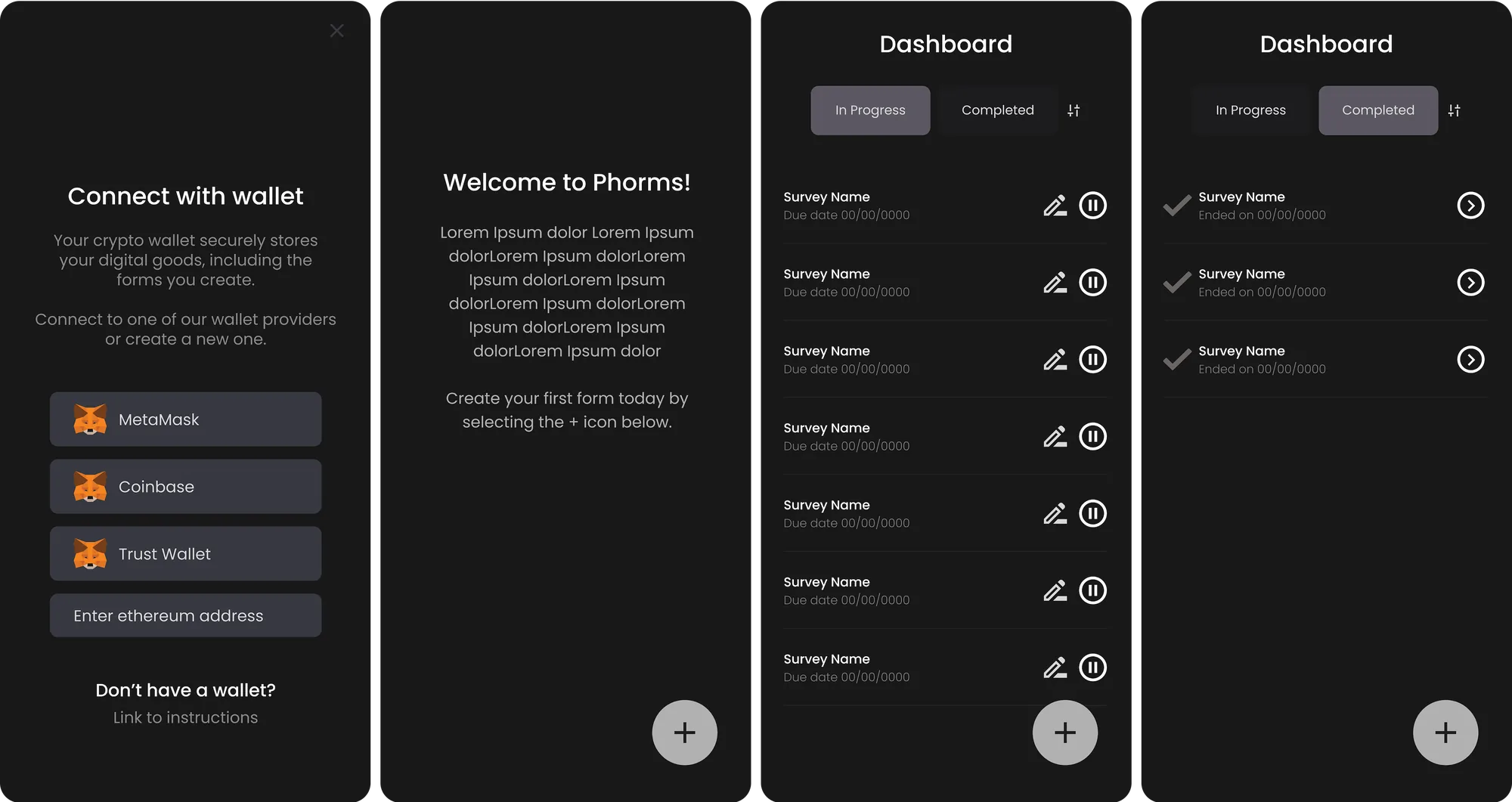
Phorms wireframes for wallet connection and the form dashboard

Dark and light

Web3 has a distinct visual style that sets it apart from Web2 apps: the colors are fresher, there's less depth and layering, icons are 3D, containers are cleaner and more minimal, and gradients are used intentionally.

Many Web3 apps use a dark theme as their base, especially fintech apps, though some stick with a traditional light theme. We saw benefits in both and wanted to explore them.
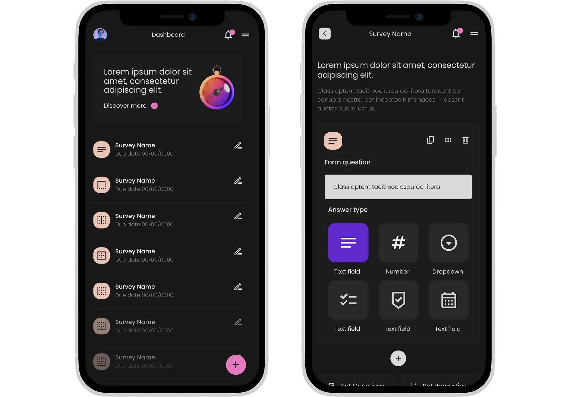
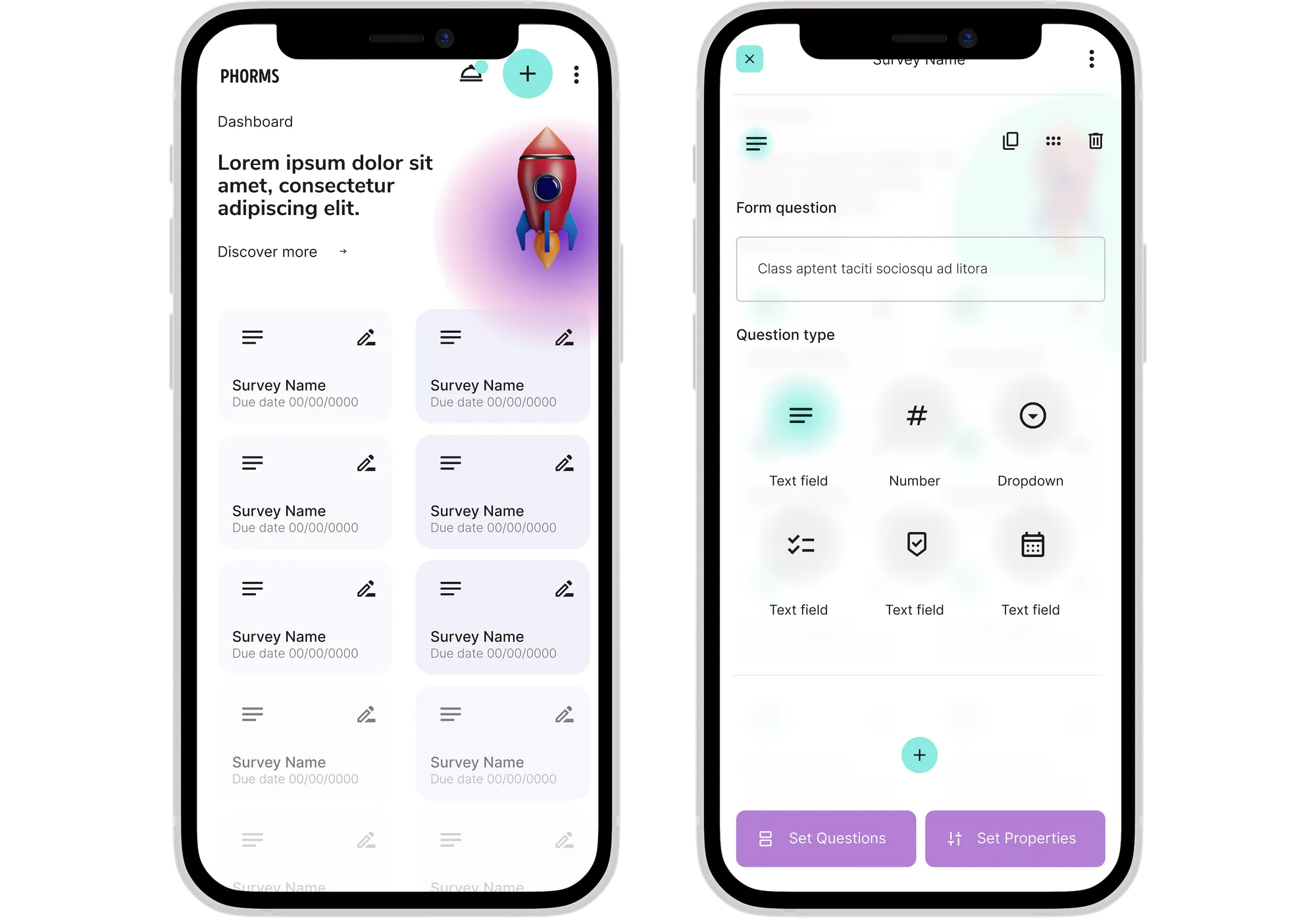
Dark theme

Phorms dashboard and form builder in the dark theme

Light theme

Phorms dashboard and form builder in the light theme

Read another case study

More selected work across enterprise AI, complex internal systems, and consumer fintech.

↑ Back to top